
Valextra Meets Bethan Laura Wood
The multi-disciplined London-based artist and Valextra collaborator is renowned for her expressive use of colour and study of materials. Here she tells us about her inspirations, her joyful aesthetic and her approach when designing the Toothpaste collection.
Valextra: Hello Bethan! Can you tell us about your approach to your Toothpaste collection for Valextra?
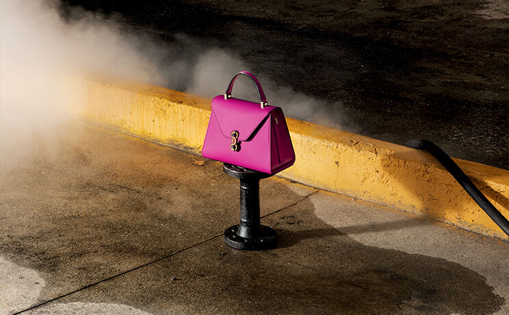
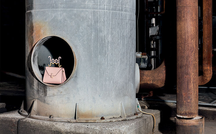
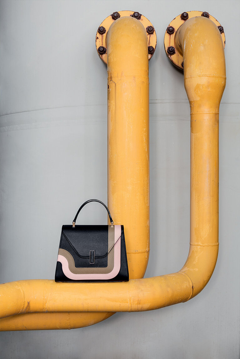
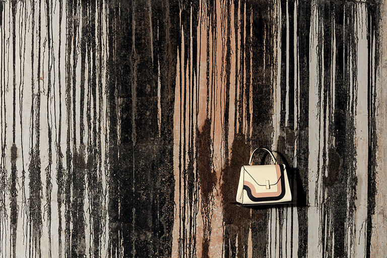
Bethan Laura Wood: I decided that I really wanted to do an intervention on the bag rather than something in the store. I’ve always had a love for costume jewellery and the world between the design world and the accessories world, so it made a lot of sense to focus on the idea of doing clasps and handles on the bags to make this jewellery for the bag. This was where I felt I could do an interesting project for Valextra that would have a harmonised conversation with Valextra’s aesthetic but allow me to introduce my wiggles and colours.
V: Why did you decide to use the materials you did for the clasps?
BLW: I was really interested in working with materials that live in the universe of scale and the place between jewellery and objects. I’ve always loved the material commonly used for sunglasses and costume jewellery – a form of plastic that Mazzucchelli call Cellulose Acetate. The reason to have the brass parts with a rhodium matt black finish was to highlight the iconic Costa edging [on Valextra’s bags]. It felt like this was the right way to interpret what is very iconic to Valextra but then taking it on a journey. That’s when I went crazy and introduced my wiggles and exaggerated the curves and the illustrated line to make the Toothpaste forms.
V: Were you happy with the result?
BLW: I love the collection very much and I use mine very often! I really wanted to make a variety that had a singular vision but with different configurations that allowed for different handles. It was really important to combine the aesthetical forms but with a function and build the forms out of the function. I love the conversations the finish of the acetate; velvety and matt finish has with the texture of the leather on the bags themselves. It was important that each component did its job both aesthetically as well as practically and the detailing of these finishes connected with thestory of Valextra.
V: How do you think people identify your work and how would you describe your aesthetic?
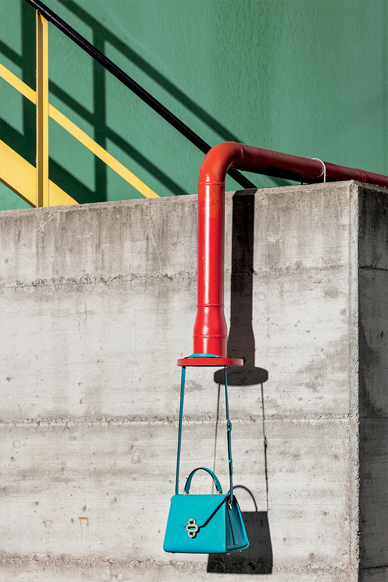
BLW: My aesthetic has always been very layered and that’s a common thread you can see through my pieces whether they are coloured or not. Most people immediately think of me as very maximal and colourful, and I’m not denying that I’m a more maximal than
minimal designer, but there’s a balance and with different projects there can be a harder graphic edge my work, too.
V: How do you feel when you see your designs in people’s spaces and is it ever hard to let’s pieces go?
BLW: At the end of the day, that’s the industry I chose to be a part of. I trained in the design genre of creativity which is built around the idea of making objects that interact with other people. I love it when I finally get to see what my work looks like in someone’s space – for example, I love seeing people carrying the Toothpaste bags and see how they’re carrying it. When we travelled to different countries while we were promoting the collection and went to China, the double wiggle to them reminded them of the traditional way of drawing clouds. I loved that different people in different places took ownership of the piece and witnessing the nuances that made a connection with them.
V: A difficult question, but here goes: can you choose a favourite item you have created?
BLW: It’s very difficult to do be made to do a ‘Sophie’s choice’ of one thing! I have a big love for the Criss Cross family, which is a bit of a cop-out because it’s the middle point of a relationship between me and Pietro [Viero]. I really love the relationship of working with one maker and building a language together. The Criss Cross chandelier is also connected to my residency from the [Design Miami] Designer of the Future award which sent me to Mexico. That had a huge influence on my aesthetic and colour palette. It was one of those projects that is connects like a spider’s web to so many parts of my practice. It’s also in your Valextra stores in Venice!
V: We’ve heard you are a bit of a collector – what do you collect?
BLW: I collect everything I can get my hands on, if I can find an excuse to collect it, I probably will! I’ve always found collecting a very physical way of digesting an environment and place around me and also a way to understand different material qualities. I’ve collected from a young age; lots of costume and plastic jewellery which quite directly feeds into the world and the universe that I built to make the Toothpaste handles. I’ve moved more into paintings an textured things now, but it really depends on what I’m working on, If I’m working on fabric projects, I find myself picking up a lot more textile-based things because I’m trying to digest that material and work with that material in different contexts. So there is a lot of stuff in my house but it is all very much practical for the use of observation and very important I have it!
V: You are known for your expressive use of colour, what joy does colour give you in your wardrobe?
BLW: It’s something that I’ve always done. For a long time, I was not so into it being associated with the work I do, but I have got accustomed to the crossover and now I celebrate that crossover as they allow me to understand and digest colours in a physical way by being surrounded by them and them on me. It’s always given me joy to have fun dressing up.
V: What energy do you think colours can give us?
BLW: We have many senses to experience the world and visual expression is something that is very accessible to people. Colour can be something that makes people nervous because it is something that people can automatically and unexplainably have a reaction to. I love having conversations with people who will suddenly have a memory of an avocado bathroom suite at their great aunt’s house and they can’t explain why that is so problematic for them. Good or bad, it’s a physical feeling that people have around colour and when you don’t get scared by that and embrace it and find the right colours for you it can bring so much joy to your space. I think that’s maybe what people are having more fun around now - the joy you can get from colour. You might have to do a few swatches before you find the right one.
V: So maybe you don’t paint a wall first, better to go for a cushion?
BLW: Go for the wall! It’s only a wall! You can repaint it. There’s a massive difference between how colour is when you have it in a small controlled space and a large space; it’s one of those things that people are nervous to do, but you do it well for yourself it brings joy and wellbeing.
V: Who are your inspirations and reference points for both your work and your wardrobe?
BLW: Within the design world, I’m a big fan of [Ettore] Sottsass. He used colour throughout his different iterations of work from the industrial to one-offs so he’s a go-to in relationship to colour. In terms of alive people, I think Bertjan Pott has a really interesting colour palette. I always find his choices of colour challenging and exciting. Martino Gamper has a palette that I have been surrounded by a lot because he was my tutor at the RCA and is a close friend. I find it interesting to understand the nuances between what’s a Martino palette and what’s a Bertjan pallete. They both have strong identities of colour. I’m a big fan of Yayoi Kusama, too. The intensity and celebration of colour in her universe is amazing. In terms of personal style, Anna Piaggi was an amazing lady of outfits and I wish to be anywhere close to her quality of styling.
